
Yesterday, after a day of drawing and painting, I felt intensely frustrated with myself. In January I started some sketchbook experiments in search of my "illustration voice," a medium and style I can use in my children's book illustration. While printmaking is the medium I work with most often, I wanted to find a more direct approach to my children's illustration, such as drawing, painting, collage, and/or mixed media. This active search for a new voice began in 2013 after taking Joy Chu's online "Illustrating Books for Children" course. I had completed a few visual story sequences, including a dummy (you can see some spreads here), and I realized that I didn't know how to execute the finished illustrations. In particular, I felt unsure of how to translate my black and white pen sketches into full-color pieces.
This has been a problem for me. I feel comfortable working in printmaking, particularly linocut, but I don't want to feel obligated to work in this medium all the time. Each particular medium has its own unique quality that has a certain look and mood. Because linocuts are carved from linoleum and printed, they often produce a highly graphic look. The way that you carve into a linocut or woodcut requires a conscious use of value, contrast, and negative and positive shapes. It can be great for well-defined compositions, pronounced linework, and shapes that stand as bold silhouettes or patterned forms. While linocuts can be very colorful, often linocuts will have a limited color palette because a lot of work goes into creating each separate color layer.
My line work tends to be the strongest and most distinctive element of my artwork. Here are some examples of linocuts I made which I think are successful:

Call to Morning, linocut, 2014

April Mouse, linocut, 2012

I Went Hunting, linocut, 2010

The Greedy Bird, linocut, 2010
I also feel confident in my pen/ink/brush work in black and white:

Here are some examples of mostly published children's illustrators who have successfully and gorgeously used linocut or woodcut in their book illustration:

From The House in the Night, illustrated by Beth Krommes and written by Susan Marie Swanson. This was actually executed in scratchboard, but the look is very similar to linocut. This won a Caldecott!


From Tiny's Big Adventure, illustrated by John Lawrence and written by Martin Waddell


From Dark Emperor, illustrated by Rick Allen and written by Joyce Sidman


Unpublished (as far as I know) linocuts by Olga Ezova-Denisova. The last image shows her carved linocut plates.

From Beastly Verse, illustrated by JooHee Yoon, poetry by various authors. I'm not sure if this was actually a print, but the colors are layered like one.
While I love linocut, there are downsides to using the medium for illustration. It can be laborious and time-consuming to plan and execute a print. Because I'm working indirectly, I first have to carve all the plates (usually one plate per color), and then I have to mix my ink colors and print the plates. It can be tricky to find a harmonious blend of colors, even if I've planned out color sketches beforehand. It's also hard to use many colors in one piece, unless I want to hand-color the print afterwards with watercolor or carve out a zillion plates or stamps, one for each color. Though as I'm learning with my recent painting/drawing experiments, it's probably a good thing for me to limit my color because my work can get lost and muddled when I use too many colors. The other drawback to using linocut is that it's difficult to make it look spontaneous in the way that a loose watercolor or crayon scribble can. I want to find a style to work in that uses drawing and painting, rather than printmaking, so that I can work more directly.
As I look at children's illustrators that I admire, I start to see some patterns. Aside from the printmakers whose work I enjoy, I am drawn to certain visual devices. I tend to like a pared-down color palette. In fact, often I like work with a lot of grays and blacks, with no more than a few main colors.


From Jane, the Fox, and Me by Isabelle Arsenault
I also love textural, patterned, and/or detailed linework. Joanna Concejo illustrates these qualities masterfully, along with a limited palette. Her work is truly some of the most amazing I've seen!


Illustrations by Joanna Concejo (first two images from Little Red Riding Hood)


I love the ethereal mark-making and use of color in Laura Carlin's illustrations for The Promise, written by Nicola Davies.

Peter Sis makes me marvel with his fantastic use of color and teeny-tiny mark ink marks in this spread from Conference of the Birds. He is one of my favorite illustrators.


I just discovered the illustrator Signe Kjaer. I love the loose freshness of her paintings.

And Henrik Drescher really shakes things up with his sketchy organic lines and bright pops of color. The first image is from his book Simon's Book.
When I look at these artists, I can see how my painting work does not look like theirs. Through drawing, painting, and mixed media, they have complete mastery over their visuals and storytelling, even in images that look simplistic or child-like. They have captured a freshness, a seemingly untamed spontaneity, with their work. There is something that goes beyond the isolated elements that I like, though. Something about the artist's content, their style, mood, medium, and composition that adds up to a magical sum. This is the artist's voice - something they're born with and that they develop throughout their lives. I know that finding and using one's artistic voice doesn't happen automatically. There is usually a lot of experimentation, practice, and muddling along the way, yet it's also innate in each of us. This uniqueness, how do we find it?
This leads me to a few questions:
What makes a picture interesting?
Seems like a simple question. I could try to replicate someone else's style exactly, but somehow it wouldn't look as good or feel the same. And it just wouldn't be as interesting as what that specific artist came up with through their own unique art processes and life experiences.
How shall I go about finding my voice in children's book illustration?
I've thought of some possibilities, some suggested by other artist friends.
- Look through all my previous work and isolate the specific elements that make a piece successful. Emphasize those elements in the different media.
- Work on strengthening weak points. Take a painting class, do more observational drawing, practice the skills I need.
- Write and work on my own story that is more personal to me. Perhaps just doing random experiments won't yield the results I seek as much as working on a specific story that has its own logic and set of problems which require specific visual solutions.
- Start with an illustration style using the medium I am most comfortable with first before trying something more difficult. For me that's printmaking. And after all, I haven't done much with linocut specifically for children's book illustration, maybe I will find that it will be more of a challenge than I thought painting was!
- Mix and match mediums. Experiment with ways of incorporating printmaking with mixed media in a way that can combine the graphically-defined look of linocut with the looseness of painting.
- Don't try to make my work look like anything specific. Don't aim to be like the artists I like. Experiment with extremes of style, medium, and content and my painting voice may reveal itself in an organic, rambling way.
- Work in a totally new medium (not necessarily visual art) to refresh my soul and gain a new perspective, then go back to what I was working on before.
What if I'll never be good enough?
Art-making is the thing I am perhaps most confident about in my life. Yet I know there are thousands (millions?) of artists better than me. And it's in the eye of the beholder anyway, so I know it's not sensible to compare. But if I'm going to make art as my living - as something I share with others that they look at or purchase or find some solace in - I want it to be GOOD. I want it to say something with visuals that only I can say in my own particular artist's voice. If someone could say it better or more uniquely, than I don't see the point of doing it myself. I know I have a unique voice, because every person is unique. But can it be unique, and good, and interesting at the same time?
Maybe after awhile I will hit upon something interesting in drawing/painting/whatever, but there is also the possibility that I will never be as good at painting as I am at printmaking. Maybe what makes me distinct can best be translated through the medium of printmaking. I don't know how I feel about that.
And now, on to a peek in my sketchbooks. I can't say I'm proud of all of these works. I like some much more than others. And some I think are downright boring or crappy. But they're just experiments and stepping stones towards something I hope I will like a lot. I don't know how long it will take me to get there. I want to find a process that I enjoy creating with, while broadening my understanding of how to use color successfully. For me, the hardest part of working with color is establishing a strong value structure and contrast. I can get lost in the possibilities of color and my work loses strength. Also, I just don't "get" painting the way I get printmaking. I think in black and white before thinking in color. But I do love color, so it's worth the effort to work on it!

Pen and ink with watercolor (A portrait of my fat lil' cat.)
Acrylic paint.

Acrylic paint with pen and ink.

Acrylic paint, collage, and the goose comes from one of my linocuts. I was seeing if I could create the "look" of linocut in paint with this dog.

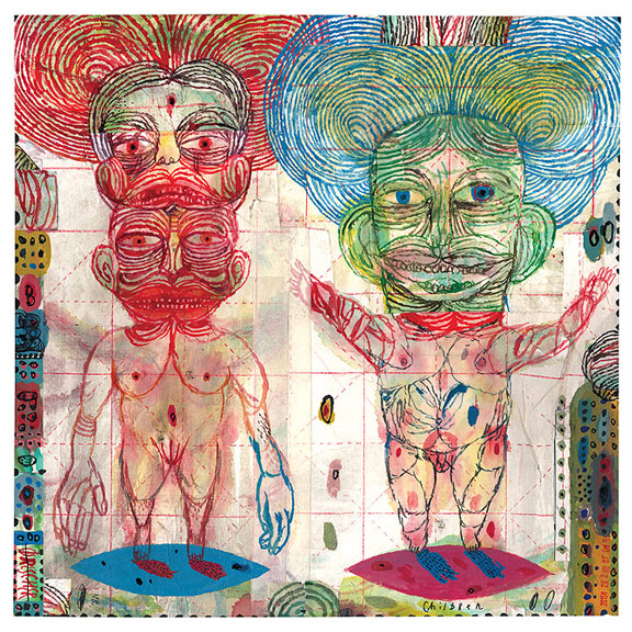
Acrylic paint and collage with pen and ink.

Watercolor, colored ink, and cut paper collage.

Watercolor with pencil, charcoal pencil, and pen and ink.

Watercolor, pencil, and sumi ink.

Watercolor on one of my linocuts.

Again, trying to translate the look of linocuts with pen and ink and watercolor.

Acrylic paint. I was pretty pleased with how she came out. I feel like I chose the colors just right for this one.

The same image, this time translated into a 4-layer screenprint. (Soon to be listed for purchase in my Etsy Shop, Sprout Head).

My sketches from yesterday. Colored pencil, some with watercolor wash laid over or under the pencil. I was excited about these drawings because I was able to get a loose, spontaneous-looking texture with the colored pencil.

I then tried to translate the watercolor/colored pencil technique to these girls, but they just don't have much life. This may partly have to do with the fact that I don't really love drawing people, I'd much rather draw animals or creatures instead.

Again, trying colored pencil and watercolor on the same subject. I like how the cat turned out with just colored pencil, and I think the bottom two girls have more life, but I still don't think they look as interesting as the cat does.

Brush and sumi ink.

Tried to recreate the top image but inject a bit more color into a small portion of the drawing.
As I work on my drawing and painting experiments, I wonder if my work will ever possess the qualities of illustrators that I admire. I realized something that works against me in painting: with linocut, even if a line is simple it takes longer to carve. I spend a long time on my linocuts, but painting can be so fast. I wonder if I need that element of time and slow care for my work to have that special quality. Some artists are great at dashing off a quick, spontaneous-looking piece of art and it's so full of personality, like the artist Quentin Blake. I know that fast does not equate with easy. When I do it, it just looks kind of careless, in my opinion. I want to create work that you can get lost in and feels fully realized.
I know I shouldn't put so much pressure on myself to figure this out right away. I can look at it as a fun challenge, a way to keep evolving as an artist. It's funny how sometimes I'll take it for granted that I'm good at something, and then realize there are loads of things I've still yet to master! But I suppose life would be boring if it all came so easy. Who knows, I may discover a new way of working that I'd never even considered before.
Dear Readers: Is there anything that you long to be good at, but feel daunted by?


+007.JPG)
+009.JPG)
+010.JPG)
+012.JPG)
+015.JPG)
+016.JPG)
+017.JPG)
+018.JPG)
+019.JPG)
+020.JPG)
+021.JPG)
+022.JPG)
+024.JPG)
+029.JPG)
+030.JPG)
+031.JPG)
+032.JPG)
+034.JPG)