Friday, March 15, 2013

Collagraph Techniques

As you might've read in this post I'm having a ball trying out different printing techniques in collagraph printing. Here is a step-by-step process of some of the techniques I've been using to make images like these:


Below are my finished plates. Some are colored differently than others depending on what color cardstock I had on hand, and some have been printed already so contain some ink residue on the surface. Making the plates is simple but does require time, planning, and some gusto with the razor blade and scissors. After planning out your image, take a piece of cardstock and start cutting your design. Glue the pieces to another piece of cardstock.  I like to use a different color for my backing cardstock to contrast the cut-out designs that I glue onto it so it's easier to see. Then I apply a coat of acrylic medium on the front and back sides to seal everything nicely so it's easier for me to keep re-using the plates. But you don't have to seal it.


I decided to combine an art-making opportunity with collagraphs. I will be in the upcoming book "Mail Me Art: Short and Sweet," as part of the Mail Me Art project. Each participating artist had to create an envelope with the back side decorated and send it to England through the post. It's a bit faint, but you can see that I measured lines that will be folded to make the envelope. I also composed my cut-out shapes and traced a light outline so I knew where I was going to place each shape when I was ready to print.

I used a cardstock stencil and rolled up ink directly onto the paper to create some background color for my shapes. This is a technique I was inspired to do by one of my collagraph workshop participants, Sarah Watson!

And here are the finished background colors. For some of them I didn't use a stencil, but just used my brayer to apply color in the outlines I had drawn.

Next I inked up all my collagraph shapes. By the way, I figured out the right colors after a few hours of experimentation. Here is my messy workspace!

And the inked up shapes. The moon is a lovely silver color.

I placed my printing paper onto the etching press, and then arranged the shapes on top of my paper.

Here are the back sides of the shapes. They have blue ink all over the edges because... well, you'll see why. I used these shapes several times so they have lots of ink residue on them. Notice that my rabbit is right up against the paper, and the house sits on top. This way, the rabbit's paw printed fully, and the house printed in the background. I ran the shapes through the etching press so the ink transfers onto the paper.

After the shapes are printed, I leave them on top of the paper *suspense!* There is another step I want to add: I take my brayer and roll blue ink around the outside of the shapes onto the paper. I like the texture they make.

Here it is after I've brayed all around my image area. I used the edge of my brayer carefully against the sides of the cardboard shapes to get very close.

And now, the moment has arrived: I pull the cardstock shapes away and VOILA! A magical rabbit leaping to the moon. Only the middle part of this image will be seen on the envelope, which is why I didn't bother coloring the entire thing.


And here are three other variations that I made on the way to getting this one image just right! There were even more of them than I'm showing here.

I will write about the creation of the Mail Me Art envelope in another post. Hope you've enjoyed this one!

Thursday, March 14, 2013

Cardstock Collagraph Workshop

Last Saturday, I led a Cardstock Collagraph workshop at Studio Two Three, a community printmaking space in Richmond, VA. I taught this technique of printmaking to art teachers of Richmond Public Schools last Fall and the teachers created some amazing work, too.

This technique of printmaking is super simple, but can produce very awesome results. Making a cardstock collagraph is basically cutting out designs in cardstock and gluing them to another piece of cardstock. You can cut out the shape and rearrange it, print backgrounds, print multiple times, change the colors, etc. Having the opportunity to teach this class again and experimenting with it made me realize that it's even more creative and fun than I first thought, and the simplicity of making the plates freed me to be more spontaneous with it than I usually am with, say, linocut printing. I also learned a lot about different techniques to try from the participants in the workshop - just one of the perks of being a teacher. Students in the class were very creative and really jumped right into it. They created some amazing stuff! Sorry that I can't credit every print with the artist's name, but I did  when I knew the name of the person who made it. Take a look!


 I created the grassy background for this one, and a student used it as the backdrop for her Alice in Wonderland rabbit! Next to this print, Chris Pool worked on a simple and elegant design for a vase of pussywillows.

Here you can see how artist Sarah Watson used the same grassy backdrop for her flying fish garden. Love the surreal image! Local jeweler Kim Young did the skunk/hummingbird/dewdrop-boy print, and experimented with changing around the positions of each of these delightfully unrelated (yet somehow fitting) images.

 This kite print is so powerful!

 Elegant elephant.

 That rabbit again (and again, and again.)

More elephant love by Emily Yeatts!

I will be doing a follow-up post showing step-by-step how I create a collagraph print. Keep a look out!

Wednesday, March 6, 2013

Children's Book Dummies

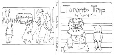
It has been awhile since I've posted. The winter has slowed me down, but I've also been keeping busy. I started an online course back in January called "Illustrating Books for Children" with Joy Chu, art director, awesome teacher, and author of the blog Got Story Countdown. I just finished my last assignment, a 32-page dummy. For those who don't know, a dummy is a mock-up or "sketch" version of a picture book. Joy emphasized that we keep our drawings very simple because this stage of illustration is used to work out the important storytelling and to establish character, composition, sequencing, pacing, and readability. That last part is harder than it seems - there were times when I didn't question that what I was depicting was obvious, but then found out that someone was confused by it. Very important to get right!


I'm keeping this post brief because I'm feeling tired today (still recovering from staying up till 4 in the morning to complete the last assignment!), but here is some of the work I produced for the class. Each of the assignments was based off a pre-existing story, but modified or changed in some way to make the story our own. At first I was hoping to write my own original stories (the closest to that was my last assignment), but I realized it was a good thing we weren't trying to work on the writing and illustration at the same time. That would have been too much! Also, the emphasis was on being able to convey a story for the most part wordlessly, without relying on text as a crutch to explain what was going on. enjoy these little snippets, and I'll be back with more detailed descriptions later! You may also view all of my work for the class here.